This series analyzes the design principles often used in advertisements and discuss how these principles are used to attract attention, influence the opinion or convince the potential consumer for purchase.
Colors in Advertisements
Color
is very simple element of still image advertisement industry. However, it
posses with great power of emphasizing
the content we want to communicate. The proper use of colors can change the
message in very subtle way and the impact may be greatly increased. If the
strong colors are used they attract attention.
On the other side, strong colors can decrease efficiency when emphasizing the
content of the message. In this case desaturated colors are more
appropriate. Also the combination of
colors play important role. There are well known combination that goes
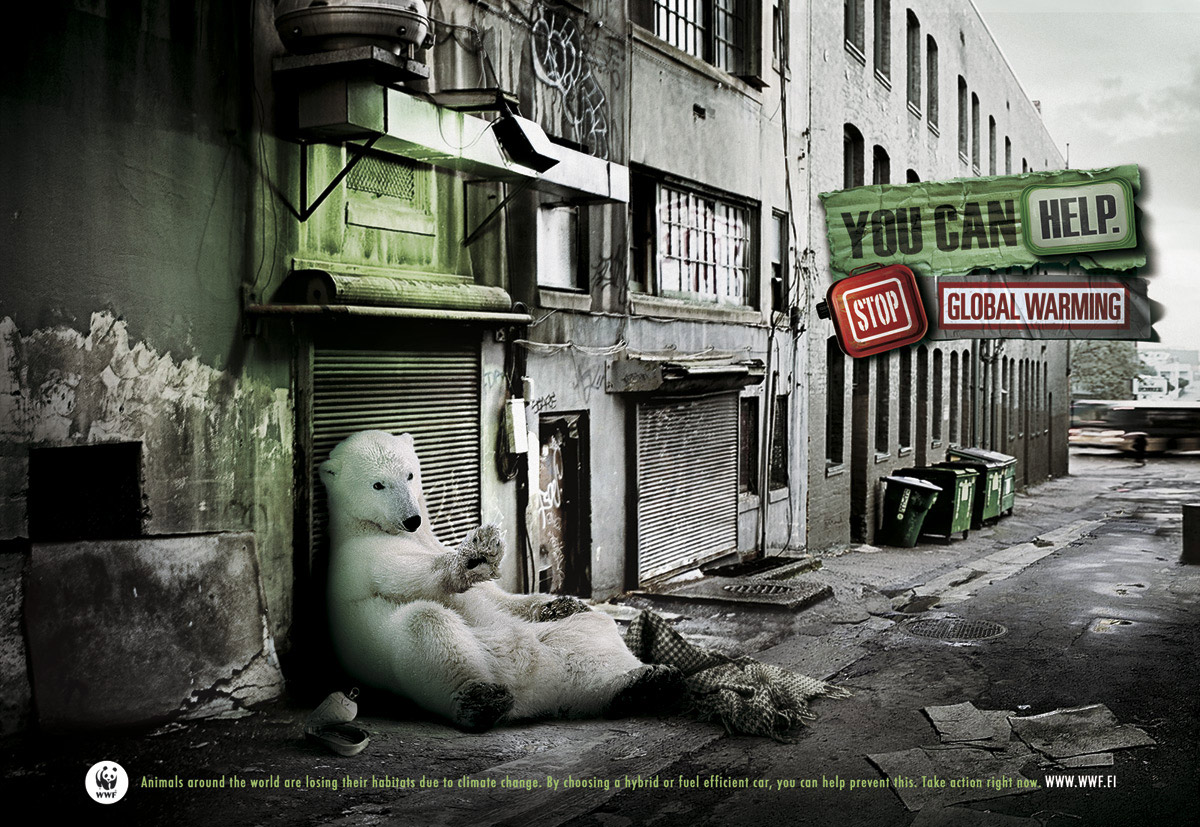
together. Red and green on neutral background makes complementary color scheme.
And it just goes very well together. We also have associated specific symbolism with different colors. For
example, green used in context with global warming means taking care of the
Earth and red emphasizes STOP sign.

Classical Conditioning
Classical conditioning is a typical example of psychology
usage in the advertising. The idea is based on principle discovered by famous
Russian physiologist Ivan Pavlov. Pairing
two stimuli, as presented in famous Pavlov’s experiment, can change the way
one reacts after receiving specific stimulus. Pavlov presented dogs with
ringing bell followed by food. The food caused dogs to salivate but after
repeated food-bell pairing the bell also caused dogs to salivate.
The advertisement also wants us to ‘salivate’ as a response to specific stimuli. In the example above exotic animal souvenirs are paired with killing animals. So next time we come to this type of exotic market during our holiday the ‘salivation’ process will be triggered and we will restrict buying such souvenirs. The best part is that all this is happening on subconscious level and we even do not realize we are ‘salivating’.
Another example of this principle used in advertising is the Coca Cola Super Bowl campaign. The advertisement presents polar bears that are playing a kind of American football with a bottle of Coca Cola. People that have seen this advertisement several times will literally start salivate for the icy cold Cola drink during watching the game. You can watch the video here.
The advertisement also wants us to ‘salivate’ as a response to specific stimuli. In the example above exotic animal souvenirs are paired with killing animals. So next time we come to this type of exotic market during our holiday the ‘salivation’ process will be triggered and we will restrict buying such souvenirs. The best part is that all this is happening on subconscious level and we even do not realize we are ‘salivating’.
Another example of this principle used in advertising is the Coca Cola Super Bowl campaign. The advertisement presents polar bears that are playing a kind of American football with a bottle of Coca Cola. People that have seen this advertisement several times will literally start salivate for the icy cold Cola drink during watching the game. You can watch the video here.